
Using Percentages in CSS

This series of posts addresses a few of the most common misconceptions I see in “Responsive CSS.” This post covers the pitfalls associated with using percentages to define the size of various elements. I’m not trying to say that you’ll never want to use percentages again, but as you’ll see, in many of the places where you might want to reach for them, there is likely a better solution!
Responsive?
Quick definition: when I say “responsive” what I mean is that whatever you’re styling should look nice on the range of viewports and orientations that you intend to support. In most cases that means things should look fine everything from ultrawide monitors to the smallest popular smartphones in use. (the iphone 5 is probably the smallest phone that is still getting a fair amount of use.. it’s viewport is 320px wide) If you’re working on a webapp that is specifically never going to be viewed on phones then these requirements are going to be a little different!
What I do NOT mean is that your views should look identical on every screen size. In fact, that would actually be problematic in a few ways. For example, the proportions of your header, footer, and the main content of your site that looks nice on a phone screen will be quite different from what people expect to see on a normal desktop monitor. A perfectly readable font-size on a normal monitor would have to be scaled down to fit within the same layout on a tiny screen, probably enough that it would be unreadable.
Generally, it’s intended that there will be some things that change between screen sizes. Some text will overflow. Margins and paddings might need to be adjusted etc. This is all fine.
Percentages
You probably don’t want to use percentages to size things, even though it’s a fairly common bit of advice on the internet. The basic thought process I’ve seen is something like the following:
I want this thing to respond to the browser’s width or height, so what I need here is to make the dimensions of my element a percentage so that it’s flexible and responsive!
The truth: most elements are already responsive to the viewport, even without using percentages. Consider this code and the gif that follows.
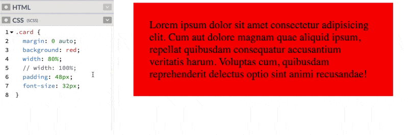
.card {
  margin: 0 auto;
  width: 80%;
  background: red;
  padding: 48px;
  font-size: 32px;
}
Obviously, this kind of works… but it’s probably not the best way to solve the problem. One issue here is that as the screen size changes, the margin to either side of the card also changes, leading to some less-than-aesthetically pleasing combinations. Generally, things look nice when the margin outside of an element and the padding inside the element is either the same or related. In this example, however, the card’s padding (the space between the words and the edge of the card) stays static while the margin changes.
Solutions
You do not need the percentage rule to make this card responsive. If you simply remove the width rule, most html elements will expand horizontally to fill 100% of the horizontal space. (For what it’s worth, this behavior is not the same as sticking width: 100% on it. Notice the horizontal overflow in the example.)
OK BUT I DON’T WANT IT TO BE FULL WIDTH.
I know…. but rather than using a percentage to define the width of the element, use a static margin. It’ll still be responsive but will look much nicer at most screen-sizes. If you want the thing to have a smaller margin on smaller screens, that’s a perfect time to use a breakpoint.
.card {
  margin: 48px;
  background: red;
  padding: 48px;
  font-size: 32px;
}

@media (max-width: 500px) {
  .card {
    padding: 16px;
    margin: 16px;
  }
}
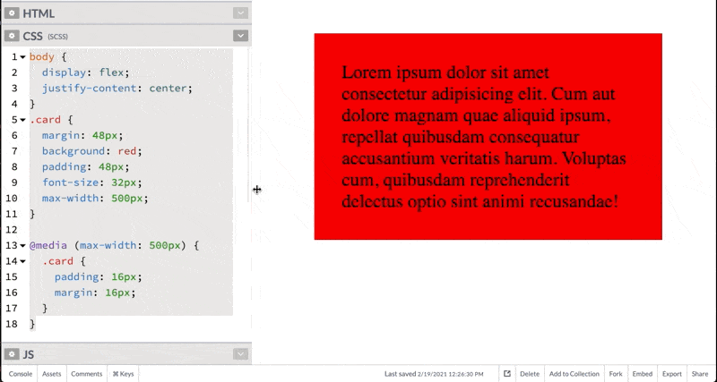
One more great addition here is a max-width so that the element won’t exceed a certain width even on huge screens. This is much more aesthetically pleasing and consistent than the percentages or adding another breakpoint (padding: 512px) for wide screens. Because we want a margin on the element, we can no longer rely on margin: auto to center it… but there are many ways to center things in CSS. I like flexbox:
body {
  display: flex;
  justify-content: center;
}
.card {
  margin: 48px;
  background: red;
  padding: 48px;
  font-size: 32px;
  max-width: 500px;
}

@media (max-width: 500px) {
  .card {
    padding: 16px;
    margin: 16px;
  }
}
There are obviously cases where using a percentage is the right choice. In particular, using something like height 100% to make a child component fill the entire height of its parent can be useful, as can width: 100% for elements that do not expand by default. (general rule: block-level elements expand, inline elements do not check here for a list of block-level and inline elements.) As a rule of thumb, however, percentages are less useful than other techniques. Setting up evenly spaced columns, another place where percentages are commonplace is better done with flexbox or grid.. you don’t even have to do the math to keep everything lined up!
Header art by Henrik Dønnestad on Unsplash
Paul
Good article! As a complete noob this was easy to understand and implement in some practice projects.
Bright
Exactly
Marco
“check here for a list of block-level and inline elements” is missing the link.
Bright
Thanks
Responsive Design: Patterns & Principles – AmayaThompson
[…] Five things that changed how I thought of responsive web design are Percentages, CSS relative units, flexbox, media queries, and hierarchy. When it comes to percentages it is always looking at the width of its parents even when adding a percent to the margin or padding. It is essential to responsive web design since it allows the element it’s assigned to to become more flexible. When doing this with images it’s best to set an image to a max-width so it wouldn’t lose quality if it gets too big. With max-width, the image’s maximum width is 100% of its parent and it’s allowed to get smaller.https://codyloyd.com/2021/percentages/ […]
Godwin Archibong
Thank you for taking the time to explain. This is very helpful and succinct.